Thursday, December 18, 2014

Plausible Impossible

Here are a few of the plausible impossible's in a Disney short with Donald Duck and his cousin; Gus Goose.


First, we have Gus knocking on Donald's door. Donald opens the door and Gus keeps knocking. Instead of knocking on the door he starts to hit Donald without noticing and as Donald is hit in the head it sounds like a xylophone. The plausible is if he doesn't notice Donald he would just keep hitting Donald until Donald made a noise. The reality is if you were knocking on a door and kept knocking when that person answered the door you may hit them but you would notice and not keep knocking.
Second, is Gus knitting spaghetti noodles into a sock. The plausible is somehow knitting wiggly noodles together. The reality is if you tried to knit spaghetti noodles together into a sock it wouldn't be easy or quick like how Gus did it. It would be messy and I'm sure frustrating especially if you tried hard.  


Next, Gus takes a whole loaf of bread and dips it into Donald's tea. The bread soaks up all of the tea into it. The plausible is the whole loaf soaking up every last drop of tea. The reality is that if you were to stick a whole loaf of bread into someones tea it would soak up some of the tea but not every last drop. 


Here Gus has eaten a big stacked sandwich and it has and accordion effect in his neck. The plausible is Gus fitting that hug sandwich into his mouth and neck without chewing or anything but swallowing. The reality is that if you were to even attempt what Gus did you would probably choke or have to chew. Someone might be able to eat that much but not in one whole big bite.


In this last shot Gus is eating multiple doughnuts without chewing. The plausible is that Gus was able to eat all those doughnuts without stopping or taking a bite, The reality is someone couldn't eat that many doughnuts that fast without chewing, stopping between doughnuts, and choking.

Character Animation


In this project I made a simple character with two side characters who told a short story. The main scope of this project was to create a character and a story then animate it. In pre-production I made a story board. I imagined a girl meeting a strange creature and helping and then this story board was created. (Please ignore the horrible quick drawings in the storyboard)  There were a lot of changes on the actual animation. I didn't use some parts of the  story board because I was running out of time to complete this project and I was trying to put too much into a small and short animation when I'm still a beginner.  

Story Board Page 1

The page below; almost all of that story board wasn't used or were changed. Through out this project I learned how to edit my ideas for an animation to save time and make things a little easier. I also learned how to better draw my character so making them move was easier. 

Story Board Page 2
Next I drew my characters and then scanned the images. There were three separate pages but I just grouped them all together here. I then cut out each piece of character in Photoshop and colored them, then I put it into After Affects for animating. 


Next time I would want to complete the whole story that I envisioned in the beginning and make it looked even better. I'd change the cloud being and make it look cuter. I could maybe even animate it in Maya if I get skilled enough. I would try to keep the girl the same and maybe only make a few changes to her and keep the background the same.

Here is the finished animation:


The next time I do a project like this I'll make it a little more simple and I'll try to draw better characters. Overall this project was really cool and fun. Seeing a character that you drew on paper come to life in a computer is amazing and it will be fun to do more.

Sunday, December 14, 2014

Postcards


I made a few postcards two go along with the seasons I made them in and one is kind of a look at me and the randomness that is me. Below is my Fall postcard with animals with fall themes like the big turkey who I'm sure was delicious and then there is the white tiger with the pumpkin (So cute). Now to make this I used the font Impact and made it a big size. I the got the pictures and made them a clipping mask on the letter I wanted it to be. I added the leaves background, and added a small drop shadow and a outline on the letters, then I added my name and I was done.


Here I typed my first name and made the letters have clipping masks on them using some pictures that remind me of my crazy self. The A,T, and N are my pets. The orange cat in the bow tie is Simba, the silly border collie is Ruby, and the sleepy black and white cat is Gus. In the K and L are artistic things, I like to think of myself as artistic because I love creative things like art and music (Even though I suck at art most of the time). The E and Y are just random and cute pictures the thing in the E is the internet sensation The Kawaii Potato. It's a potato that's kawaii (Kawaii mean cute in Japanese). Then in my Y the is the funny Batman riding on Superman's back because poor Batman can't fly.


Here is my second seasonal postcard which I made very recently. I wish anyone who reads this a Happy Holiday. Anyway onto how I made this fun postcard. I got the pretty background and got a Christmas font and typed From: my name, Merry Christmas, and Happy Holiday's. I the grabbed a picture of  Santa added a white inner stroke to make it look  more like a picture. I put a flower over it and gave it a shadow and satin. I saw that the bottom of the postcard looked a little bear and I decided to add in the hamster (Hal) with Christmas ornaments on either side of it and the pine tree star which I thought looked super cool. 


Monday, December 1, 2014

Floating Mountain Tutorial


In this moving mountain's in Photoshop project the scope was to take something (the mountain, dragon, humming bird, and Mufasa) out of an image and put it into another image (the sky). In my pre-production process the idea for putting Mufasa in came from my friend Greta and I thought it was genius.  The humming bird though was all my idea which I thought it was cute and funny. I thought the same for the dragon.


I learned along the way that not all images cooperate when you try to refine the edge of a selection. I had to erase parts of my selection instead of refining the edge. I'M LOOKING AT YOU HUMMING BIRD.


Something I would do differently next time would be to add more shading on images and add different things into the sky like instead of a mountain add a house or animal with photoshopped wings.  Something I would do the same would be that I'd keep the humming bird and Mufasa.


I learned how to copy a cloud, make it another layer, and move it in front of the mountain to make the mountain look like its actually in the clouds. I also learned how to make the mountain have more shadows the it originally had.


I really like how this project turned out. I think it looks really cool and crazy but thats my mind for you and a little bit of Greta's crazy mind too. I hope you all enjoy my finished project too.


Wednesday, November 12, 2014

Shadow Tutorial


In class we were to take an object from a image and give it a shadow and put in a new background. I used the quick selection tool to get the kitten then I used refine edge to get the extra fur around the body. The refine edge tool wasn't working on the head so I just used the eraser and erased the unneeded part of the image. I then duplicated the kitten layer turned it on its side, added a gradient on the shadow, and then made the shadow match up with the kitten. I put the grassy background in and edited the shadow to make it look better on the background.


Monday, November 10, 2014

Sphere Tutorials

Illustrator Tutorial: Glossy Sphere Tutorial

In the Illustrator tutorial I made a circle with a blue color fill then added an oval at the bottom with a lighter blue fill then I added a white oval on top to give it a shine. I learned how to add a second lighter color at the bottom to make the sphere look glossy. I want to learn how to make it more glossy/shiny in the future.

Photoshop Tutorial: Yin Yang Sphere Tutorial

In the photoshop tutorial I made a simple circle and then used the pen tool to make the shapes of Yin and Yang then colored them in and shaded them. I added the dots and shaded those too. I learned how to use the pen tool to make the Yin and Yan sections. I want to learn how to make the Yin and Yang sections more like the real Yin and Yang.

Friday, November 7, 2014

Sphere's

My Sketch of a Sphere:

Illustrator:

In my class we have been working with sphere's in Illustrator and Photoshop. In Illustrator the sphere was easy to make but the color shading was difficult to work with so it looks odd unlike Photoshop where the sphere is easy to make and the gradient is also easy. Both of their shadows were easy to do although i think the Illustrator shadow looks better. 

Photoshop:

Moving Background

In this moving background animation project three major things I learned were how to make different layers move to make a moving scene which is what I did in the whole animation, how to edit images and put them into my animation which I used on the moon, cloud, and trees, and how to connect different layers together to make the viewer think nothing has changed but i made two layers of grass and moved them at separate times. 

Here is my finished animation:


Saturday, October 11, 2014

Typography

I did a origami typography of my initials.I learned to make letters out of simple rectangles. The A and B were easy but the K was more difficult because of the angle the legs are in. If I could do something differently I would've tried doing the K different and I want to do research about how to write out all the letters not just K, A, and B. 


Character Walk

My character is a fire sprite. I wanted to do something with a element and fire seemed like a good place to start. 


It was hard to get the legs to move smoothly because of how I drew the legs. I didn't have any issues with making the keyframes. I first made the walk cycle of my character for two steps and then i copied it and pasted it to make it a complete cycle. I moved my character for each step and tried to make it look normal. Each steps timing was the same and if I needed top slow it down I'd move the keyframes. 


I learned how to make my character walk across the screen, to make certain parts of my character move when I move another part, and I learned how to build a character in separate parts and make t move as a whole. I had a little trouble coming up with a character at first but I eventually thought of one. I would like to make the walk better if I get another chance. I really like how I did and I want to improve from here.

Tuesday, September 23, 2014

Google Logo


In the beginning of Google in 1996 Google was first called Back Rub. Back Rub was renamed Google a year later and the name Google came from the word the word googol which means the number one followed by a hundred zeros.


Google went through many designs but finally came to a conclusion of the font Catull with all the letters primary colors but the l. The l was made green to show that Google doesn't follow the rules.

Here is my favorite version of an older Google logo (The first one) that I found and a more recent version (The second one) which I thought was cute.

Thursday, September 11, 2014

Font Anatomy


My font is Dot Matrix. The font is simple but cool and looks it very interesting and different to the eye. My font fits my personal brand by being simple but different and unique in its own way. It could hide in a crowd of dots but could still be able to stand out if you looked hard enough.

Monday, September 8, 2014

Inch Worm Animation


In the inch worm animation I have a worm inch its way across the screen. To make the worm look like its inching across the screen I used the pin tool to pin parts of the worm so it would bend and move like it did in the animation. 

Sunday, September 7, 2014

Bouncing Ball Animations


In these animations I learned how to move a simple object in an animation in different ways. Version 1 the ball bounced at the same rate for the whole video.


In Version 2 the ball bounced like it was dropped and slowly stopped bouncing.


In Version 3 the ball bounced from the left side of the screen to the right, it slowly stopped bouncing at the end.

Thursday, September 4, 2014

Pencil Design


I learned how to make a pencil in Adobe Illustrator by using the rectangle tool, rounded rectangle tool, and the polygon tool. This was the first thing I made in Illustrator and learned how to draw and make shapes. The hardest part was making the polygon into a triangle.


I made my own pencil and a can to hold it. I used gradients and made a longer and thinner pencil. The  gradients are different in Illustrator than in Photoshop and were harder to figure out. 


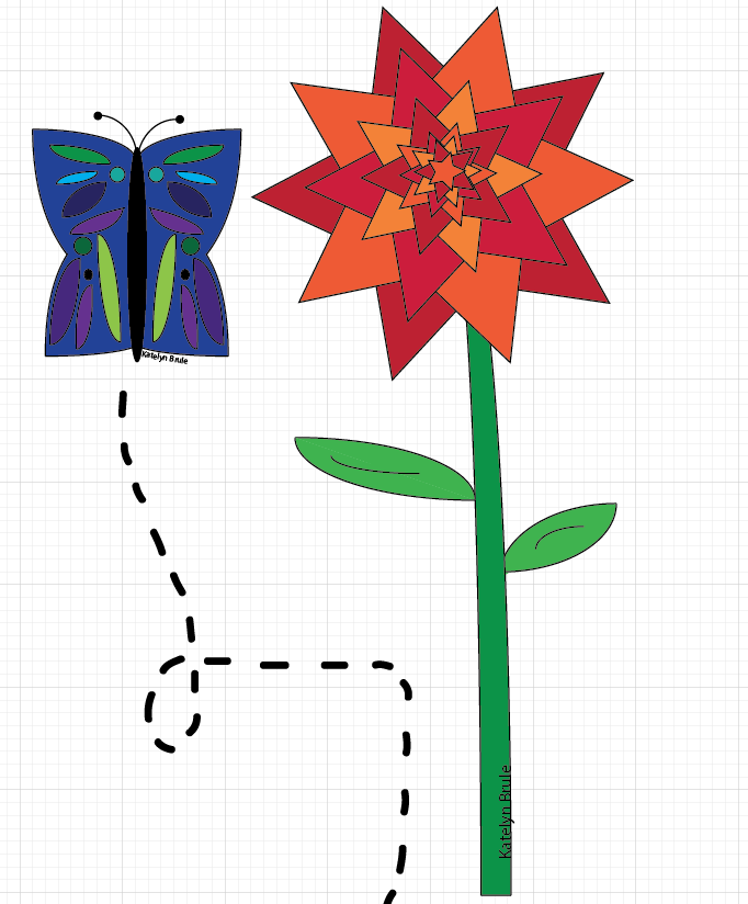
This butterfly and flower were two of my complimentary objects for my creative project. The wings of the butterfly wings were the hardest because I used the arc tool. I used hot and cool colors and this was one of the first things that came into my head when I was told to make a creative piece. 

Tuesday, August 26, 2014

What is Graphic Design?


Graphic Design is a form of human expression to me. You can make anything you can think of using graphic design. 

It is all types of art and whether you're using photoshop on a computer, taking a picture, painting, or drawing then you're using graphic design. We use graphic design to communicate, express ourselves, personalize our lives, and to help us become ourselves. We all use it in every aspect of our lives right now. It's everywhere and anywhere.