Tuesday, September 23, 2014

Google Logo


In the beginning of Google in 1996 Google was first called Back Rub. Back Rub was renamed Google a year later and the name Google came from the word the word googol which means the number one followed by a hundred zeros.


Google went through many designs but finally came to a conclusion of the font Catull with all the letters primary colors but the l. The l was made green to show that Google doesn't follow the rules.

Here is my favorite version of an older Google logo (The first one) that I found and a more recent version (The second one) which I thought was cute.

Thursday, September 11, 2014

Font Anatomy


My font is Dot Matrix. The font is simple but cool and looks it very interesting and different to the eye. My font fits my personal brand by being simple but different and unique in its own way. It could hide in a crowd of dots but could still be able to stand out if you looked hard enough.

Monday, September 8, 2014

Inch Worm Animation


In the inch worm animation I have a worm inch its way across the screen. To make the worm look like its inching across the screen I used the pin tool to pin parts of the worm so it would bend and move like it did in the animation. 

Sunday, September 7, 2014

Bouncing Ball Animations


In these animations I learned how to move a simple object in an animation in different ways. Version 1 the ball bounced at the same rate for the whole video.


In Version 2 the ball bounced like it was dropped and slowly stopped bouncing.


In Version 3 the ball bounced from the left side of the screen to the right, it slowly stopped bouncing at the end.

Thursday, September 4, 2014

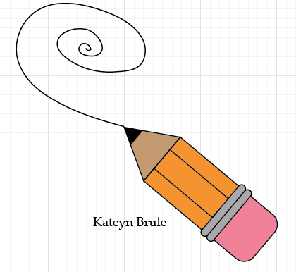
Pencil Design


I learned how to make a pencil in Adobe Illustrator by using the rectangle tool, rounded rectangle tool, and the polygon tool. This was the first thing I made in Illustrator and learned how to draw and make shapes. The hardest part was making the polygon into a triangle.


I made my own pencil and a can to hold it. I used gradients and made a longer and thinner pencil. The  gradients are different in Illustrator than in Photoshop and were harder to figure out. 


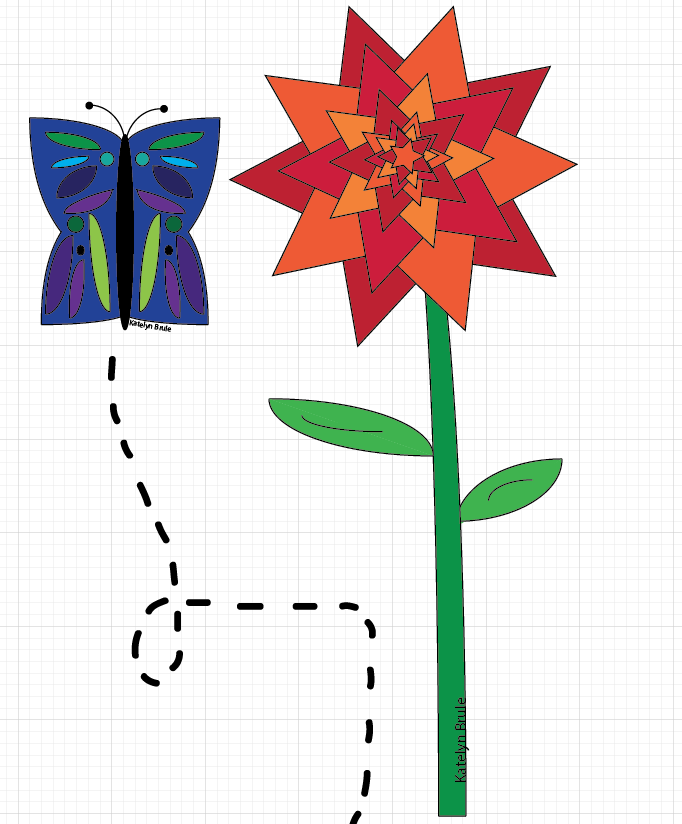
This butterfly and flower were two of my complimentary objects for my creative project. The wings of the butterfly wings were the hardest because I used the arc tool. I used hot and cool colors and this was one of the first things that came into my head when I was told to make a creative piece.